Scoopy
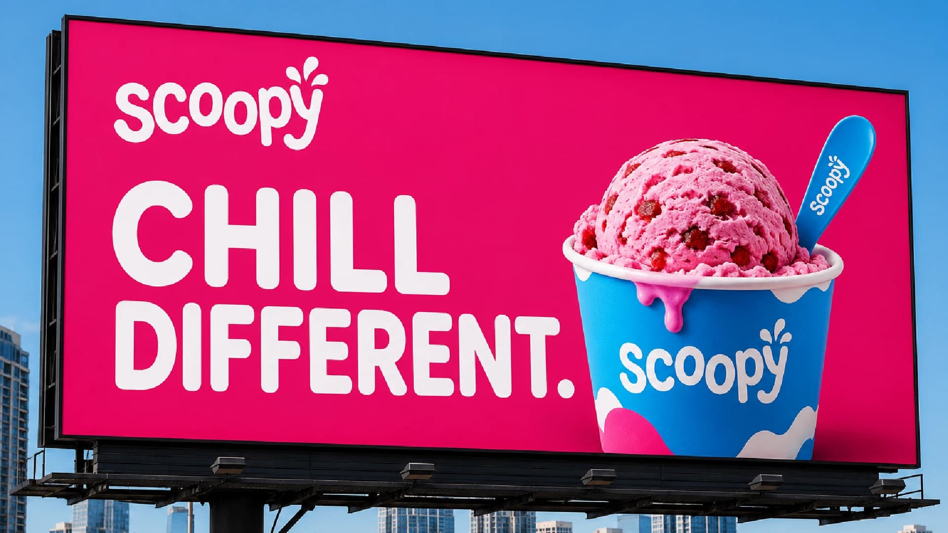
Chill Different — a complete ice cream brand identity from wordmark to billboard that makes Scoopy unmissable.
The Challenge
Scoopy needed a full brand identity system — wordmark, icon, colour variants, and billboard presence — that would make them the standout ice cream brand in Pakistan.
Design Process
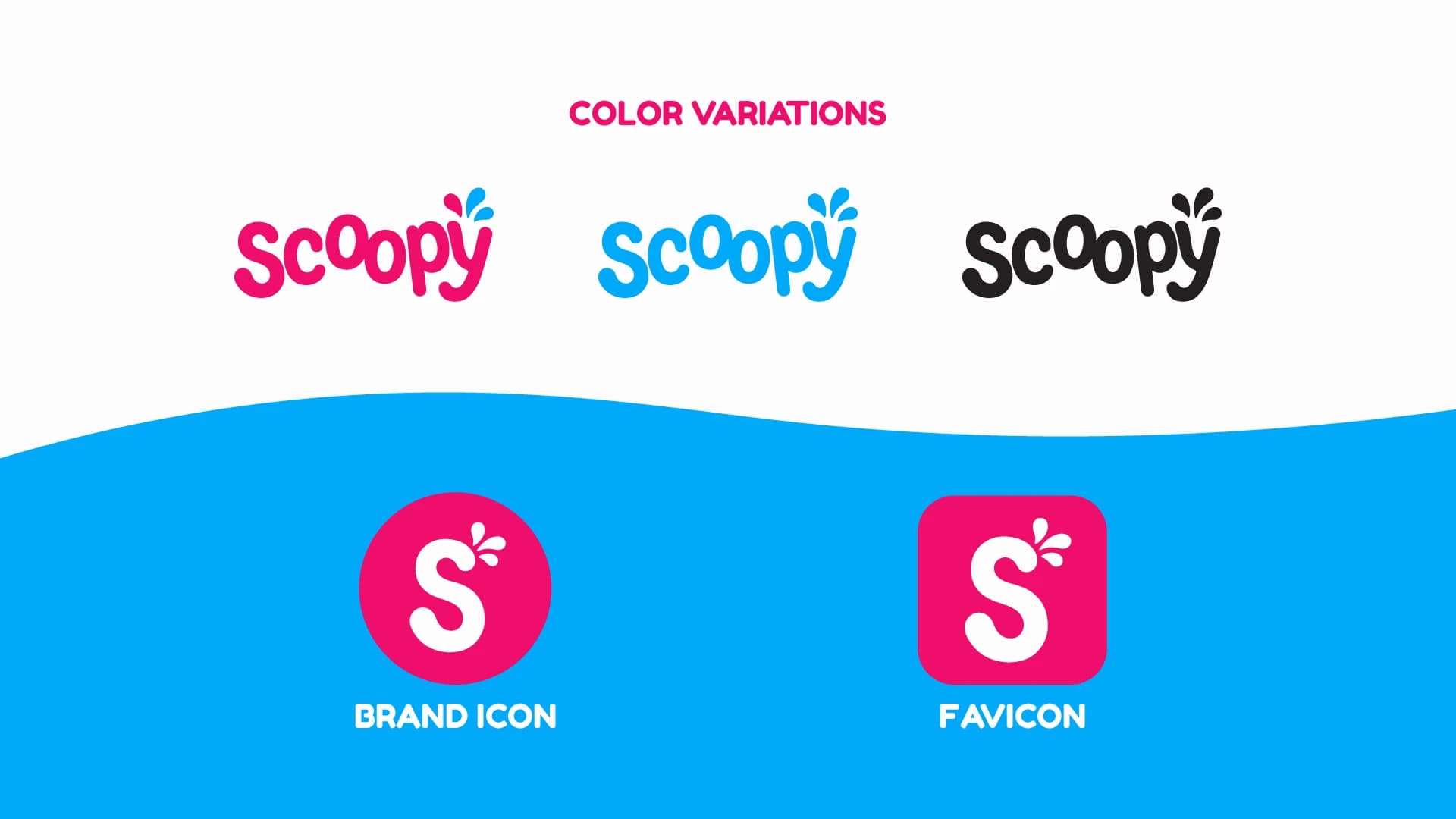
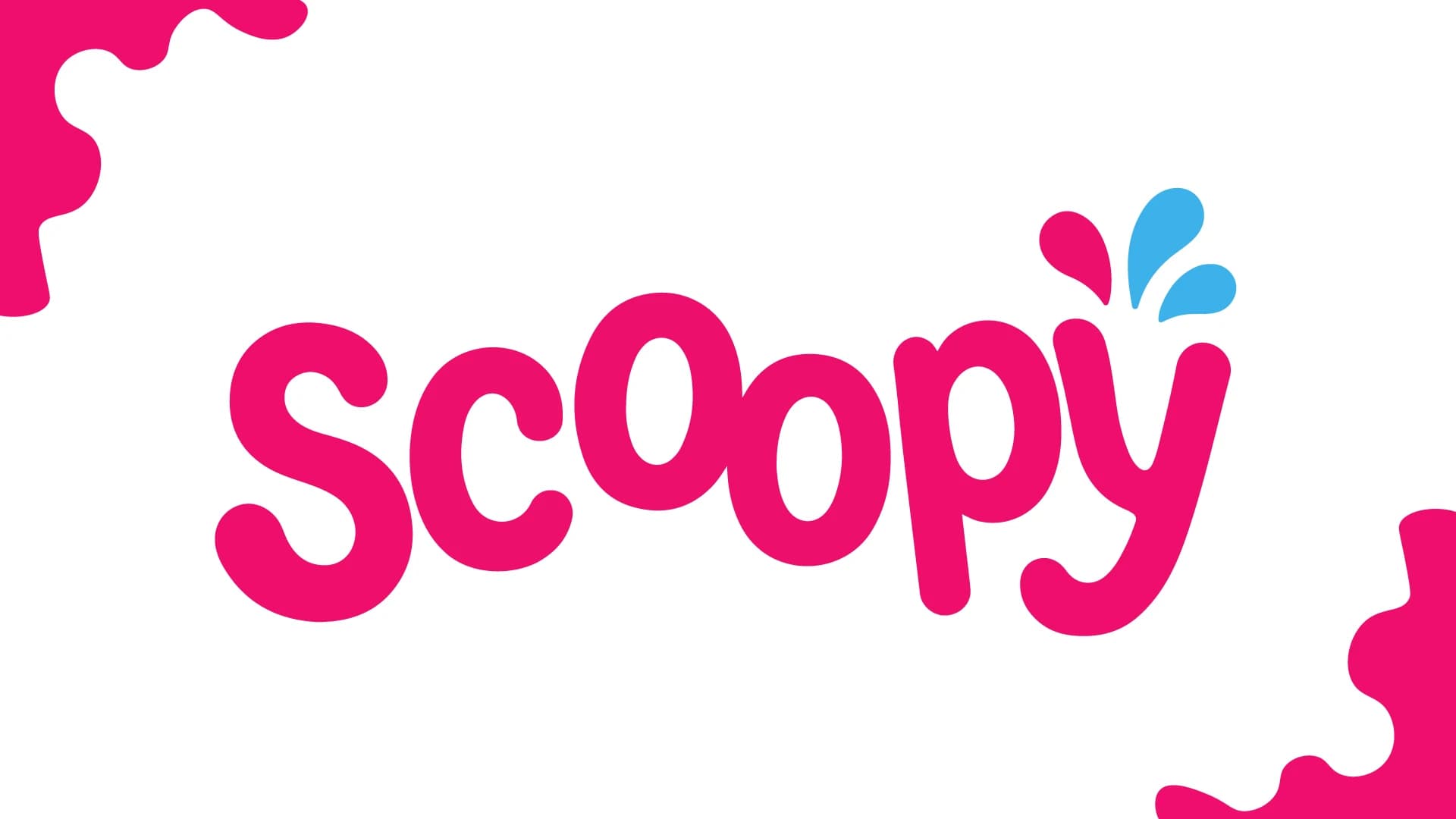
Designed the Scoopy wordmark in a clean, fresh pink with a playful blue splash graphic, developed the brand icon and favicon, created colour variant applications, and produced a billboard mockup demonstrating the Chill Different positioning.
Design Showcase
The Result
Scoopy launched as a visually cohesive brand across physical and outdoor channels, with the Chill Different tagline establishing a unique voice in the ice cream category.
“Scoopy looks and feels like a proper brand now. The billboard alone drives customers to our stores.”
Related projects
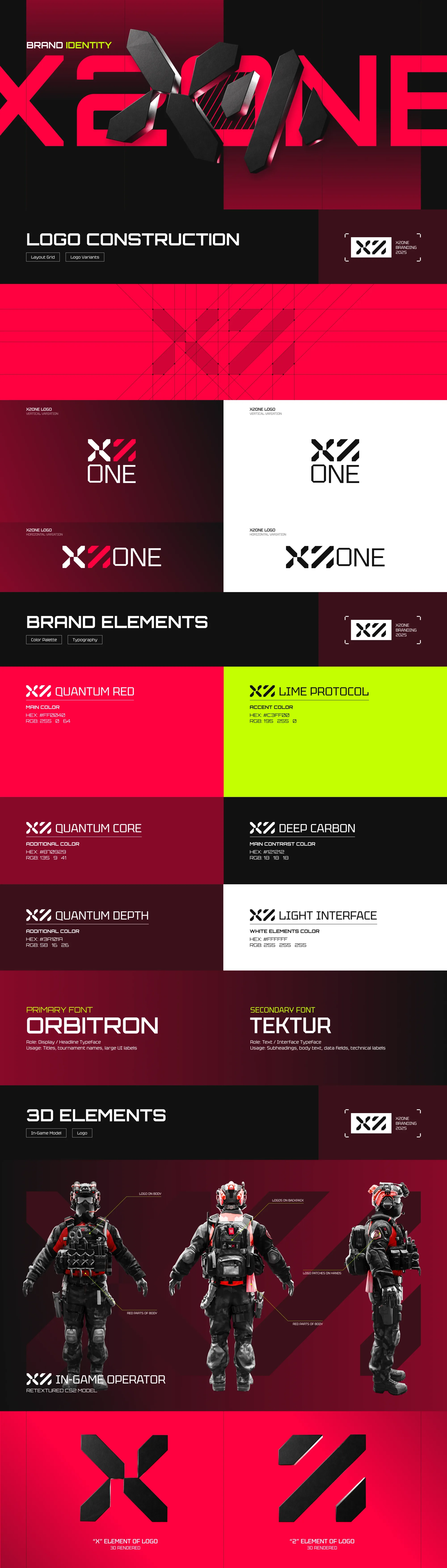
X2ONE
Gaming brand identity in red, black, and lime that signals dominance in the esports arena.

Med Art Clinics
Bilingual healthcare logo that bridges trust and modernity across Arabic and English markets.
Royal Meva
Premium, natural logo for Royal Meva, a dry fruit brand whose name pairs "Meva" (dry fruit) with the "Royal" standard of quality it refuses to compromise on.
Ready to Transform Your Brand?
Get the same quality results for your brand. Free consultation, fast turnaround.
 Chat on WhatsApp




* First draft within 48 business hours · Reply within 4 business hours · Fixed quote within 24 hours